|
|
Post by fggafagas on Feb 24, 2009 18:24:04 GMT -5
Ook, you win, it's short.
|
|
|
|
Post by Ollie W on Feb 24, 2009 22:03:53 GMT -5
The cape emblem doesn't get used in animation for th same reason: it's too much hassle to animate a design on a constantly moving surface. Bruce Timm's gone on record about this. let's stop acting like Singer's the only person to come to this realization. So CGI comes first? And enough with bashing CGI already. This isn't 1978. Special effects have advanced light-years beyond what was available at the time, and the flying in Returns had a greater range of speed and movement than was ever possible in the Reeve era. And if anyone thinks Donner would have shunned CGI had it been around at the time, they're kidding themselves. I'm not bashing CGI I'm bashing those who overuse it. Who the heck cares if SR had a greater range of speed for the flying sequences if it didn't look real. This was 2006 and SR created effects less effective than those created in 1978. Two obvious shots are a fair comparison. In SR we have Brandon flying over the water towards New Krypton. Now compare that to the shot in S3 when Chris is flying over the water after the Junkyard battle. Easily no contest, S3 wins as far as flying effects go. I wouldn't deny that Donner would've used CGI, of course he would. But I'd expect he'd use it with some restraint. He's said many times in interviews that he doesn't like the direction films are going in with regards to visual effects. Reality has no place in a Superman movie. Then what am I watching it for if I can't believe. Where is it written that Metropolis HAS to be New York? Should we write off all the other incarnations of Superman that either didn't use New York or opted for a stylized design for a fictional city? Honestly, you might as well say that everything outside of Donner is invalid at this rate. I'm using Donner's film as a comparison because the film WORKS. At no point was I implying that it is the only way. 30 years after the release of STM fans are still very much in love with it. I'd be extremely surprised if you could say the same thing about SR in 30 years time. by that logic, Singer couldn't use any sets either (or Donner for that matter). Because after all, sets aren't real. They're large rooms inside film studio buildings doctored to portray real or fictional places. I meant nothing of the sorts. Sets are REAL and when done right they can be truly effective. The FOS set created by Donner and Barry takes my breath away every time I see it. My point was that the classic style that Singer went for lacks the sort of reality that Donner was able to achieve. |
|
Metallo
New Member
The worlds finest heroes
Posts: 17,075
|
Post by Metallo on Feb 25, 2009 1:38:39 GMT -5
Reality...in a movie with a flying man...yes.
Singer brought plenty of reality to the movie. Thats why they picked him. Even though he had a superpowered character a lot of the way he shot things seemed to follow a more realistic approach...like the way he stopped the plane.
Singers problem is that he didn't bring ENOUGH awe inspiring fantasy and wonder. Even in terms of his relationship with Lois and his emotions it was the most realistically grounded Superman we've ever seen.
At least the cape got longer in the sequels.
|
|
|
|
Post by stargazer01 on Feb 25, 2009 15:13:01 GMT -5
Greatest Criminal Mind said,
"and the shorts aren't quite as small."Yes, they are in the pic below, plus it has the SR S on the belt. I quite like it.  Oh, and the boots are short as well; I know some people hated the size of the SR boots.  ;D You need to scroll down a little to be able to see this pic of Supes and the other leaguers. www.comicbookbin.com/Justice_league_of_America030.html
|
|
|
|
Post by stargazer01 on Feb 25, 2009 16:02:06 GMT -5
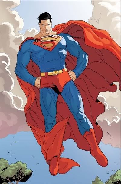
Superman DOES have a huge cape now in the comics (like Routh), the shield is often drawn shiney and slightly raised (like Routh), and the cape has at various times had no S on the back (like Routh). Yup, like this one  |
|
|
|
Post by Jor-L5150 on Feb 25, 2009 19:54:15 GMT -5
 jesus! the cod piece!!!
|
|
Metallo
New Member
The worlds finest heroes
Posts: 17,075
|
Post by Metallo on Feb 25, 2009 20:14:20 GMT -5
"Either he haz zee big one or he haz nothing!"
|
|
|
|
Post by Ollie W on Feb 25, 2009 20:21:40 GMT -5
Ollie W, your entire argument boils down to "Donner is perfection, anything else is wrong. That's rubbish. I've said many times that in the current era of filmmaking SR is the best Superman movie we could have hoped for. Especially considering the disastrous Supes movies that nearly made it to the screen. Singer had his idea (a very good story idea) but along the way it got lost in bad writing and casting. I am not a Superman nut. I just love the Christopher Reeve Superman films. However despite what you may think I do enjoy other peoples take on the character. Which is why I enjoy the first season of Lois and Clark. We agree to disagree. You obviously enjoyed Singer's take on Superman, I did not. No one is right or wrong. |
|
|
|
Post by stargazer01 on Feb 25, 2009 22:46:15 GMT -5
 jesus! the cod piece!!! ;D I noticed that too! This Superman is well, really super! haha  |
|
|
|
Post by adam15 on Feb 25, 2009 23:12:31 GMT -5
As a practical matter Superman's cape should not go past his waist... like when he has to sit down or go to the bathroom it would get in the way!!
|
|
|
|
Post by Jor-L5150 on Feb 26, 2009 1:34:45 GMT -5
As a practical matter Superman's cape should not go past his waist... like when he has to sit down or go to the bathroom it would get in the way!! talk to any woman with long hair.....  |
|
HOSNI
New Member
Posts: 555 
|
Post by HOSNI on Feb 26, 2009 2:31:46 GMT -5
"Either he haz zee big one or he haz nothing!" I used to flick it and Christopher would say "stop it kidder, stop it" |
|
HOSNI
New Member
Posts: 555 
|
Post by HOSNI on Feb 26, 2009 2:58:15 GMT -5
It's been gradually getting longer since the Silver age comics.
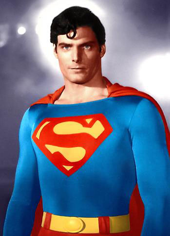
If the cape is to be more cloak-like, the neck line of the jump suit (in the movies) should be a little lower and wider. A bit more like Reeve's suit around the neck, distinct folds on the shoulders then make it as long as you like I say!
In the case of Superman Returns, had they done that Brandon would have looked bulkier.
|
|
|
|
Post by adam15 on Feb 26, 2009 11:52:45 GMT -5
When Al Salkind said "either he has a big one or nuthin" why did it have to be an eithor/or scenario??? What would have been wrong with an average size; did it have to be so enormous that it draws attention to itself? They like went with one extreme with Reeve and the complete opposite direction with Routh!
|
|
|
|
Post by ChrisM on Feb 28, 2009 8:47:13 GMT -5
I think Reeve's costume design is the most iconic but I realize they could improve on that with better materials. Mainly, replacing the spandex or whatever they use with something that is more form-fitting... but NOT to the SR extreme - that just made him look too plastic.
|
|
ye5man
New Member
1%
Posts: 7,928
|
Post by ye5man on Feb 28, 2009 9:17:33 GMT -5
 jesus! the cod piece!!! Aye, but they got the hair right. |
|
Legsy
New Member
Alright, alright, alright...
Posts: 15,339
|
Post by Legsy on Feb 28, 2009 11:29:55 GMT -5
  Joe Shuster disagrees. |
|
ye5man
New Member
1%
Posts: 7,928
|
Post by ye5man on Feb 28, 2009 11:44:24 GMT -5
The character has been refined significantly since the 30s/40s  |
|
Legsy
New Member
Alright, alright, alright...
Posts: 15,339
|
Post by Legsy on Feb 28, 2009 11:54:20 GMT -5
The character has been refined significantly since the 30s/40s  I want a wig like that. Yes, but the wonderful thing about Superman, or any comic book character, is being able to redefine the character. It's not written in stone Superman's' hair has to be parted in a certain direction. It's been parted to the left and to the right the past 70 years and sometimes it's not even parted (Reeves and Cain). It's all up to the artist, in this case it's Bryan Singer. |
|
Metallo
New Member
The worlds finest heroes
Posts: 17,075
|
Post by Metallo on Feb 28, 2009 12:17:35 GMT -5
Exactly. This aint from the 40's.  |
|
|
|
Post by Jor-L5150 on Feb 28, 2009 13:25:18 GMT -5
The character has been refined significantly since the 30s/40s   fukkin iconic. |
|
|
|
Post by fggafagas on Feb 28, 2009 14:58:50 GMT -5
Except the modern logo is much better than the original.
|
|
Metallo
New Member
The worlds finest heroes
Posts: 17,075
|
Post by Metallo on Feb 28, 2009 15:16:52 GMT -5
Thats pretty subjective and up for debate. Like was said what do you mean by "modern?"
|
|
|
|
Post by Jimbo on Mar 2, 2009 19:49:22 GMT -5
I've always liked Reeve's S the most, the one on his chest. The silver 3D one is pretty cool too. I hate the marketing one, which looks like the one the TV Superboy had.
|
|
|
|
Post by stargazer01 on Mar 2, 2009 20:05:24 GMT -5
The suit through the ages (live action):  |
|